Monday, June 21, 2010
Box Plot
A box plot graphically shows data using quartiles. It also shows the lowest, highest and median observations. This box plot shows the sale growth for different companies. This company shows above average growth.
http://www.obermatt.com/uploads/pics/box_plot_sample.gif
Star Plot
A star plot displays multiple variables. Each point represents one observation. This star plot is related to geochemistry.
http://members.iinet.net.au/~geotech/Geoservices04.htm
Scatter Plot
In a scatter plot, it shows the correlation between two variables; in order for there to be correlation the data must not be scattered randomly. The diagram that's being shown here has a strong negative correlation.
http://www.qimacros.com/qiwizard/scatter-plot-example-negative-correlation.jpg
Wednesday, June 16, 2010
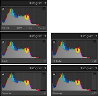
Histogram
Doppler Radar
Cartogram
Monday, June 14, 2010
Topographic Map
DOQQ Map
Hypsometric Map
Wednesday, June 2, 2010
Planimetric Map
Mental Map of Cambridge
This is a mental map of Cambridge and it is based on a personal perception of the city. Mental maps show what people know from memorization and experience. Based on this map we can conclude that this person spends a lot of time in this certain area of Cambridge and probably little time outside this space.
http://ocw.mit.edu/ans7870/MAS/MAS.965/f04/assignments/tripti/Assignment10/index.htm
Subscribe to:
Posts (Atom)