
Digital Elevation Model (DEM) is remote sensing to create data for evaluational maps.
http://members.shaw.ca/cismaps/dem/cded1250map.png
 Digital Line graph (DLG) is used for United States Geological society for elevational maps for data.
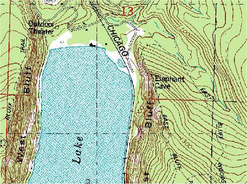
 DRG maps is a scanned image of a topographical map from the USGS that is made into a digital map. This is a DRG map of Chicago.
 Isopachs are contour lines of equal thickness over an area.
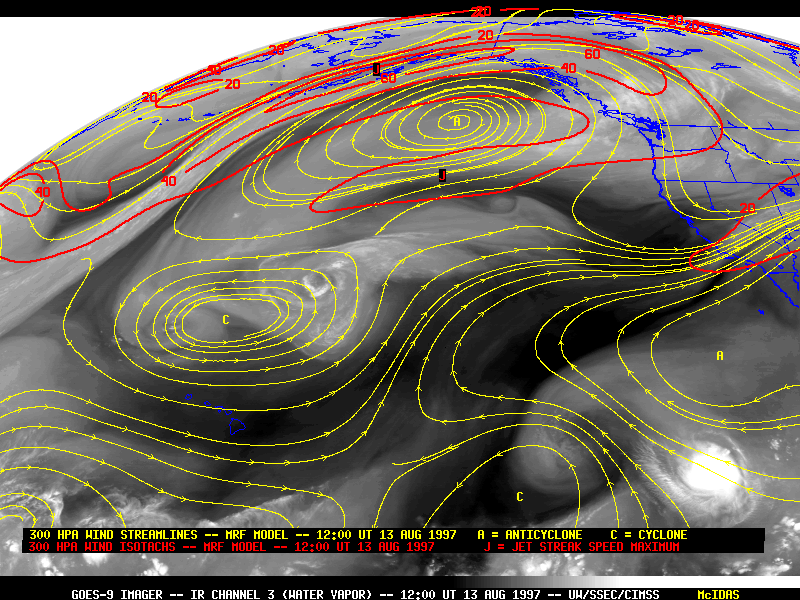
 Isotachs are lines of equal wind speeds that are mostly contoured in the upper levels of the atmosphere.
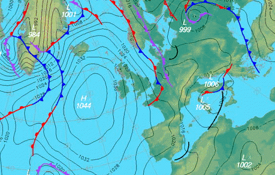
 Isosbars are maps that use lines to show air pressure in areas on the earth. This is an isobar map of Europe.
 Lidar stands for light detection and ranging and is a system that measures and locates objects by using light from sensors.
 Black and white aerial photo are images taken from aircraft or satellites of buildings, Earth's vegetation and so on. This is a image of New York's central business district.
 Infrared aerial photos are used to keep track of changes in our environment such as vegetation. This is a infrared aerial photo of a sunset trail.
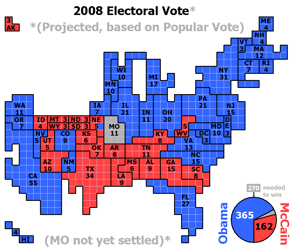
 Statistical maps are types of maps that display the quantity of data such as rainfall, population, etc. This is a map of the census bureau showing the metropolitan and micropolitan statistical areas.
 A flow map show the sequence of information or data. This map show the sequence of truck flow coming from the southern region of the United states.
 Isoline maps uses lines to show values of data. This is a map of forecast winds in the United States.
 A propaganda map is used to influence people to change their beliefs about a certian thing. This is a map through Ronald Reagans eyes showing how its the U.S. vs USSR.
 Correlation Matrix discribes the relationship between a number of varibles. This correlation matrix shows the relationship between the parts of the body and cancer.
 A Similarity Matrix shows two variables and how similar they are to each other. This map is showing the relationship between human genes and colon cancer.
 A Thematic map is a type of map that uses any topic connected with any particular area. This Thematic map is showing the new businesses in the United States.
 A PLSS map divdes land based on the Public land survey system. It is also called the rectangular survey system. This is a PLSS map of Florida.
 In a proportional circle map, data is based off the size of the circles displayed on the map. This proportional circle map shows the Filipino population in the south east region of the United States.
 A Dot Distribution map uses dots to represent people or other features. This is a map of the United States and one dot represents 7,500 people.
 Cadastral maps are used to display legal ownership of property. This map image was taken by using a tethered balloon sensing system and shows land parcels in a developing country.
 A mental map consists of memorization of a personal perspective of an area. This map shows the west coast and the person that made it is likely from the west and has done a lot of traveling throughout the west coast.


 This is a mental map of Cambridge and it is based on a personal perception of the city. Mental maps show what people know from memorization and experience. Based on this map we can conclude that this person spends a lot of time in this certain area of Cambridge and probably little time outside this space.